Wednesday, March 19, 2008

Poster - Any suggestions?


I'd like some people's opinions on this poster idea. I know that after reading it the most common question is gonna be "What does Mario have to do with anything!?" It'll sort of make sense if you think about the first stereotype: "Playing video games makes you a nerd." When doing this, I started thinking about all of the stereotypes people have said to me throughout my life, and this is the one that I think I have probably heard the most. So I thought to make Mario a symbol for that first stereotype. I think that the imagery will attract people from a distance, and then they will want to read the whole poster. ...And plus, I just really wanted to use this black and white Mario image. Is that a crime!? Anyway, my goal is to stamp out stereotypes, bringing to attention how unfair they are. And everyone's comments will help me reach that goal!

posters


i love this movie poster because the colors play well together. they are all part of the same color palette but manage to each stand out and be bright and vivid. i am also very found of the muted antique look- i find it captures my attention


i love political posters, especially the ones from communist china and the USSR. A deep tone of red is in almost all political posters and it gives the sense of power and desire. this like most political propaganda is easy for most people to relate to- it is simple, clean, and colorful, catching the eye of any passer by.


the new yorker magazine cover isn't a poster but is seen by millions of people. the images are familiar because the magazine has a certain artistic style, simple uncomplicated and simply pretty. the images usually hold some childish innocence and aesthetic. like a poster the image must be convincing because it need to sell. it is it's own advertising.

all three of these images are powerful and passionate will remaining simple so to me that makes strong propaganda.

Poster
–noun
1. a placard or bill posted or intended for posting in a public place, as for advertising.
History
-noun
1. a continuous, systematic narrative of past events as relating to a particular people, country, period, person, etc., usually written as a chronological account; chronicle

Some Tutorials for Photoshop + Illustrator

Tuesday, March 18, 2008

Project 3 Feedback

I won't be in town for the interim critique, so I'm posting my idea here so that you guys can give me some feedback.

I made a rhizome chart/concept map for taboo and one of the branches was related to eating. One of these branches led to fancy table settings: a possibly intimidating number of utensils and glasses, the "taboo" of not using the "right" one. The particular utensil formation speaks not only to levels of class, but also geographic differences. (A "traditional" continental European table would not be set the same way as a "traditional" Japanese table.) Plus, there's a certain sense of being "in the know," which makes one group separate from another, more diverse but also more exclusive.

Anyway, my poster would be a "public service announcement" identifying all of the utensils, to make it not seem as exclusive or intimidating. While this poster topic isn't some grand cause, I thought it would at least be amusing!

Here's the first draft. I'm not set on any of the typefaces or colors yet. I plan to have bits of information about all of the forks, if not all of the items, next to their labels.


I'm also considering adding bubbles around the text (with outlines/arrows?) to make it more readable. I also might change the quality of the image, to be more "drawn" looking.

Any comments/suggestions?

Errol Morris


It's a good think I'm not late on this.

So-Errol Morris is a documentary filmmaker. He has made 8 documentaries, starting with Gates of Heaven in 1978. This film is about the pet cemetery business. Roger Ebert has it on his list of the top ten films of all time.


I focused on Morris's film The Fog of War: Eleven Lessons from the Life of Robert S. McNamara in which he interviews Robert McNamara, the US Secretary of Defense during Vietnam. McNamara is an incredibly controversial figure in recent American history and in this film, he does all of the talking. He recalls much of his life, focusing on the things he learned while in office including the Cuban Missile Crisis and Vietnam. Morris presents all of this in a somewhat non-biased way and lets the viewer judge the actions of McNamara uninfluenced.


Oh, and here's his site.

Monday, March 17, 2008

funny posters

CLICK HERE!!!!... or else

More posters...

urbanposters.com

Artist Statement Project 2


Using advanced blending and layering techniques that I learned over the course of this class, I chose to create a piece that focused on nature's presence in all living things. I used a reflected image in a vanity to show off nature's beauty as well as to show a basic connection to nature that we all share. I chose a bathroom to create a private environment, where personal reflection meets with a physical one.
I recently worked n altering the brightness and contrast with the original image, and I feel that I was able to enhance the colors, which make the girl really stand out as the focal point of the piece. I plan to continue with this idea, making a series of images that relate nature to humanity.
-Jason

Tuesday, March 11, 2008

simple but still very eye catching


who doesn't like angels with laser-shooting-trumpet-things?

the black and white etchings look great juxtaposed [thats for paul lol] with the bright blue pink and yellow

Friday, March 7, 2008

Vacation...!?


Hey, hey! I just want to say, everyone have an awesome Spring Break!

Wednesday, March 5, 2008

Posting posters

David Lance Goines -- vaguely art nouveau, layered colors, unified style. It appears he also designed the awesome circular Ravenswood logo.


Jean Tinguely and Niki de Saint Phalle -- handmade, handwritten, handdrawn, doodled, colorful. Some of their other prints/posters in the book have better text hierarchy than this one. (Also: Shout Out to the Centre Pompidou.)

WPA Creative Printmakers Group (~1939) -- by Harry Herzog and Jack Rivolta, respectively. Bold, graphic, printed/silkscreen, mid-century type, the feeling of expansive space/big ideas

Illustrator! <3

cf. Alarmed Dog Encountering Pink (Leon Golub), a painting/drawing I have posted on my wall... (.jpg of .pdf of .ai)

nature


I am a true believer that we are a part of nature. Nature is not only around us in our envirnment but it runs through us.
the human body is made from natural materials unless a person chooses to change their body. The human body is one of the few completetly nature things in our very modern world. we are organic material placed in world made of synthetic products.
this project is meant to remind us that nature is part of us and we can not run away from it and destroying it would be a form of self destruction.

Posting Posters Posting Messages About Posters I'm Posting


Despair.com-Where innocence goes to die.

Barbara Kruger's commentative posters rock my wordy world.

Communism-you're guilty of it, you music pirate, you.

Some online resources for Poster Design


Interdisciplinary Arts

Under Interdisciplinary Arts lies an umbrella of concepts and ideas when it comes to making art. I find the most interesting part of these ideas is the artists and viewer relationship lines and barriers that are crossed and skewed. The conceptualization behind this can make really dynamic art. A piece that can question who is the viewer and is the artist is quite appealing. When some can control their interpretation by essentially editing which parts of the art they see and how it is perceived in their own eyes or those around, questions of who is the artists is really challenged being that the notion of being an artist lies truly in the concept of the work, especially in the contemporary world. Installations and Performance works that become heavily dependent and interactive on the viewers participation is skewing the line of what is art because the viewer is essentially making it. It may be the artists intent for this to occur, as intent is a major factor in contemporary art as well, but there still lies a question in originality and truth in the work. Contemporary art is frustrating beast that can't be tamed. I think in many cases it should be.

Interdisciplinarian

The significance of interdisciplinary art...book-making, installation, and performance, where to begin.
First of all, I wasn't totally sure what "interdisciplinary art" meant, other than that upper-division art students here get to take classes that are interdisciplinary. I thought it meant taking classes that are not of their specialization. Well, now I know.
I had never heard a series-like work called a "book" before without literally being a book, though it makes perfect sense after reading the chapter. I also didn't know Anselm Kiefer (one of my favorite artists) ever made a book, no surprise that he used dense metal like lead. I'm going to Ireland with Bethany and Sean from WARP this summer and I believe it's going to be a book-making class, so I hope to apply some of the things I learn in this class about it in a few months as well.
Installation is what really does it for me, though. A combination of 2D art and 3D art seems ideal. Beyond just that, as Stewart explains, the incredible significance of space and time is a solid point she makes. Additionally, the importance of context is more important (I believe) in installation art more than any other art form. The possibilities of confronting people while on their daily route with something that shatters their expectations by transforming a certain space is something I look forward to do one day. The three advantages as she lists them are well-put: 1. a fresh perspective on a familiar setting or situation, 2. a large scale (which I love working in), 3. increased viewer involvement.

Interdisciplinary Arts-Text and Type

To begin with, I did not know that installation and preformance art had their own "hybrid art form" called interdisciplinary arts. In terms of the visual books, I understood what they were and have seen them in museams as well. However I did not realize that differet page lengths and book sizes conveyed different meanings. In our day and age I feel it is common knowledge that different fonts and sizes convey different meanings. I did not realize that book making and letter press styles was such a huge genre of art. I also did not know the amount of time and questions that needed to be addressed before inserting text, for example "How resonant are the words, how long is it, where is it positioned on the page?" (353). I knew what installation art was but I never knew the proper way to describe it to my peers and parents. The fact that you actually occupy space and time does heighten your experience as you become part of the work. I understand the advantages of installation such as the large scale and ablity to transform space but I did not find any disadvantages in the chapter. I also did not know anything really about preformance art, I found the 3 futuristic qualitites helpful. Blurred Boundaries, the artist and the audience, collaborative and ephemral were all catagories I had never learned about before. I disagreed with the advantages of preformace art because I do not feel that it creates a strong connection usually between the audience and the preformer because most of the time I feel the audience is still left in the dark.

interdisciplinary arts

Something as normal as a book with its usual formatting can be changed and questioned. Designing the pages in a unique way or making it interactive so that when you flip the page it creates a new design is very interesting. Making a book a piece of conceptual art that has meaning in its display and not just the words or images can be powerful and add an additional layer of meaning.
Text can also be altered an used to bring about meaning. Often I tend to just write without thinking of the using literary devices that could make my prose more meaningful or easier and pleasant to read. I really like how Edward Gorey chose to use a rhythmic pattern in his book that make you want to flip to the next page so that the rhythm is not broken.
Picking fonts has always been one of my favorite things to do for any project, but I did not realize how important the placement of them were as well. The spacing, size or repetition of words can make a impact on the words themselves.
This artist is Ed Mcguiness. He is a current comic artist that is known for his art in the Batman/Superman series first released in the early 2000's. Mcguiness unique style has got him doing books for both DC comics as wellas Marvel.
This Artist is Shephard Fairey. Fairey is known for his obey giant stencil that set the pace for the rest of his career. Fairey does many street posters and stickers but also does work for galleries. Recently he statred his own design firm while selling his obey clothing and prints.

This artist is Art Chantry. Chantry was most popular during the 90's because his style of design reflected the grudge feel of the time. Many say his imagery influenced the skater culture. Of that time, Chantry undoubtely lead graphic design from an innovative stand point. Chantry has done many album covers for many groups including Nirvana.


Posters

I really like the placement of the words as well as the nice use of white space.
I like this one because of the way it was illustrated. It's simple yet it really stands out. The bold use of red is also nice.

Again, I like this one for its illustrative quality. The text was also goes very nicely with the look and feel of the poster.


Interdisciplinary arts

Bookmaking is probably one of the most intimate works an artist can make. You can pick it up, read it, look at it, and for a few minutes you are totally connected to the artwork.
I feel installations are very hard to accomplish in a successful way. I did now know anything about that type of artwork until last year. I am really not familiar with it so i find it confusing and interesting at the same time.
Reading and learning about visual books in this chapter is what i enjoyed the most.

Interdisciplinary Arts

I was expecting to learn more about performance art because I'm so unfamiliar with it and I feel like I need to know more. I never really thought of performance art as a breakdown of "high art" from galleries and museums because a lot of performances do happen within this context and are only appreciated by the pompous art connoisseurs. But she does make sense, that performance art can reach a broader audience and have a stronger impact. Her breakdown on the things to consider when doing performance art is somewhat helpful. I've never really considered the ephemeral quality that is so inherent and necessary for a performance piece, but now I obviously will.

I think she illustrated the different effects of type was somewhat useful too, to consider size, shape, placement, and repetition not only in a visual sense but also in an aural sense. I think that recognizing that words have sounds and rhythm is extremely important.

Other than that, I wish she had gone more in depth into visual books and installations, like how she did with visual elements earlier on in the chapter. Also, I think a lot of this stuff is hard to learn from a book, it's more important to actually go through the process and experience these problems yourself.
It's pretty easy to find stuff about poster history, so I don't think it's necessary to elaborate on that. The general consensus seems that a poster is printed, and utilizes involves textual and graphic elements.

I think something that's pretty funny is that tons of things have been made into posters and they are now sold en masse only (thinking of the poster sale at the Reitz colonnade). So what once started as the introduction of a new fine art, has been overtaken by its reproducibility and accessibility. Obviously there are still printmakers and graphic designers making fine art posters, so it's not like the art of the poster is dead. It's definitely still very much alive and growing - I'm just saying that nowadays the immediate reference you make when you hear "poster" is not "art", but "advertisement".

When I think posters, I mostly think of old late nineteenth and early twentieth century posters like Jules Cheret and Alfons Mucha. I also think of posters today we see in FAC by our own graphic designers, for Ligature and concerts and Payne's Prarie and whatnot. I guess here's three that I like in particular:


Alfons Mucha's Four Seasons:


So this is one of Mucha's typical art nouveau posters. I think the reason why I'll always love his poster work is because the imagery seems so classic and timeless. The line and color qualities are exactly what I'm attracted to. I'm always attracted to the interaction between delicate and strong, which is exactly what those black outlines exemplify. There's an organic beauty and an air of mystery about all his female figures. They promote this idea of beauty that is natural, introverted.. something that's not advertised very often anymore.


Shepard Fairey:


I first heard about Shepard Fairey when my roommate, who's a graphic designer, said that they got to meet him or visit him or something. Anyways, this is an example of his most recent work. A lot of his stuff is huge and painted as murals moreso than posters. He uses the conventions of propaganda to promote nonviolence and the end of war. I like his imagery because he uses this color palette (red and black) that is stereotypically violent in order to promote something that's completely the opposite. He's putting the power of propaganda into a peaceful and welcoming context.
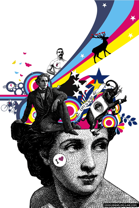
Echo Chernik:


I liked Echo because he's a contemporary art nouveau designer who uses old poster influence to create imagery and type that is relative to today's market and ideals. Though I like the original art nouveau better, I feel like there's something satirical in Echo's work that I think is really funny and maybe even poignant. I feel like there's a good chance that I'm just imagining that this element exists, but there's like an aesthetic he has that's somewhat kitschy, as in, its reminiscent of over manufactured illustrations of buxom women with no substance or reason for existing other than to please your visual palette. But when he juxtaposes it with this art nouveau design, it becomes something that's undeniably attractive and... just that process alone, that happened in my head, is worth liking this guy.

Tuesday, March 4, 2008

Interdisciplinary Arts

Things i didn't know or never really thought about:

-A visual book is an experimental structure that conveys ideas, actions, and emotions using multiple images in an integrated and interdependent format. ( no single pages, the combination is what creates the artwork.

-Visual books create a very direct connection between the audience and the artist.

-More than one type still can be used effectively.

-Layers of meaning can be created through a contrast between the visual and the verbal.

Poster

Courtesy of answers.com:

Eye-catching printed paper announcement or advertisement that is exhibited to promote a product, event, or idea. Posters were popularized by the mid-19th-century invention of lithography, which allowed coloured posters to be produced cheaply and easily. Henri de Toulouse-Lautrec was noted for his poster art, which often advertised Parisian cabaret performers. Poster art flourished with the rise of the Art Nouveau style, as seen in the work of Alphonse Mucha. During World War I posters were used for recruiting and propaganda, and the industrial boom of the early 20th century gave rise to advertising posters for every conceivable product and event. The later rise of film and television advertising led to an eclipse in poster art.

Wednesday's Class

Please research artists and upload three posters you like and tell why you like them. Look up the definition of poster and history.

Interdisciplinary Arts

The instiallation section was most interesting. I became interested in them last semester when I was in WARPhaus, and I agree that it takes a lot of work to make a space effective in conveying what you want it to. I had never thought about the whole visual book concept, though. It was interesting how the different artists created different relationships between words and images. The Edward Gorey connections between the alphabet and page divisions were sort of disturbing... but, at the same time you can't help but wonder what the next letter is gonna be. You know?

Reading: Visual Books, Text

This section shows how diverse the field of bookmaking can be. One of the most important aspects of the book is how, in most cases, the structure necessitates an individual "reading," so the process of experiencing the piece is very personal and intimate. This process is opposed to that of looking at a painting on a wall, where many people can look at the work at once. Digital installations can have a similar personal experience if they are installed on a computer, for single-user viewing, instead of projections/room installations.

The inventive methods of constructing the books illustrated in the chapter is inspiring. Bookmaking presents a way to make a two-dimensional piece become an (interactive) art object.

The singsong rhythm in the Gorey alphabet not only unifies the separate pages through repetition and rhyme, but it also plays a contrast to the dark subject matter. The later paragraphs about the rhythms of different languages brings up another prose-poem narrative consideration. Each language has a different rhythm, different homonyms, and thus their poetry and word interactions can create clever phrases or pertinent links that might not be possible/conceivable in another language.

Monday, March 3, 2008

NATURE PROJECT

  • Please delete your older compositions, and the leave most up to date one. Also please attach your artist statement (more than 1 paragraph) right under your image before Wednesday.
  • Check the calender for homework.
  • Please fix your images and print them out on nice glossy Photo paper. No normal paper will be accepted. You can get it done at Target Copy.

from nature


to me nature can be found in all of us. we come from nature and that is something that will never go away and we can't run from.
i was inspired by the phrase " for dust you are and to dust you shall return"